
Welcome back to Marketing Magic for Makers – the series that turns the tricky bits of running a handmade business into something easy! We’re kicking off a new run of posts, and first up: the one thing that’ll do more for your sales than almost anything else on this list. Yep – it’s photos.
Here’s the awkward truth: you could be making the most beautiful handmade jewellery in Britain, and if your product photos are dark, blurry or full of background clutter, people will scroll straight past.
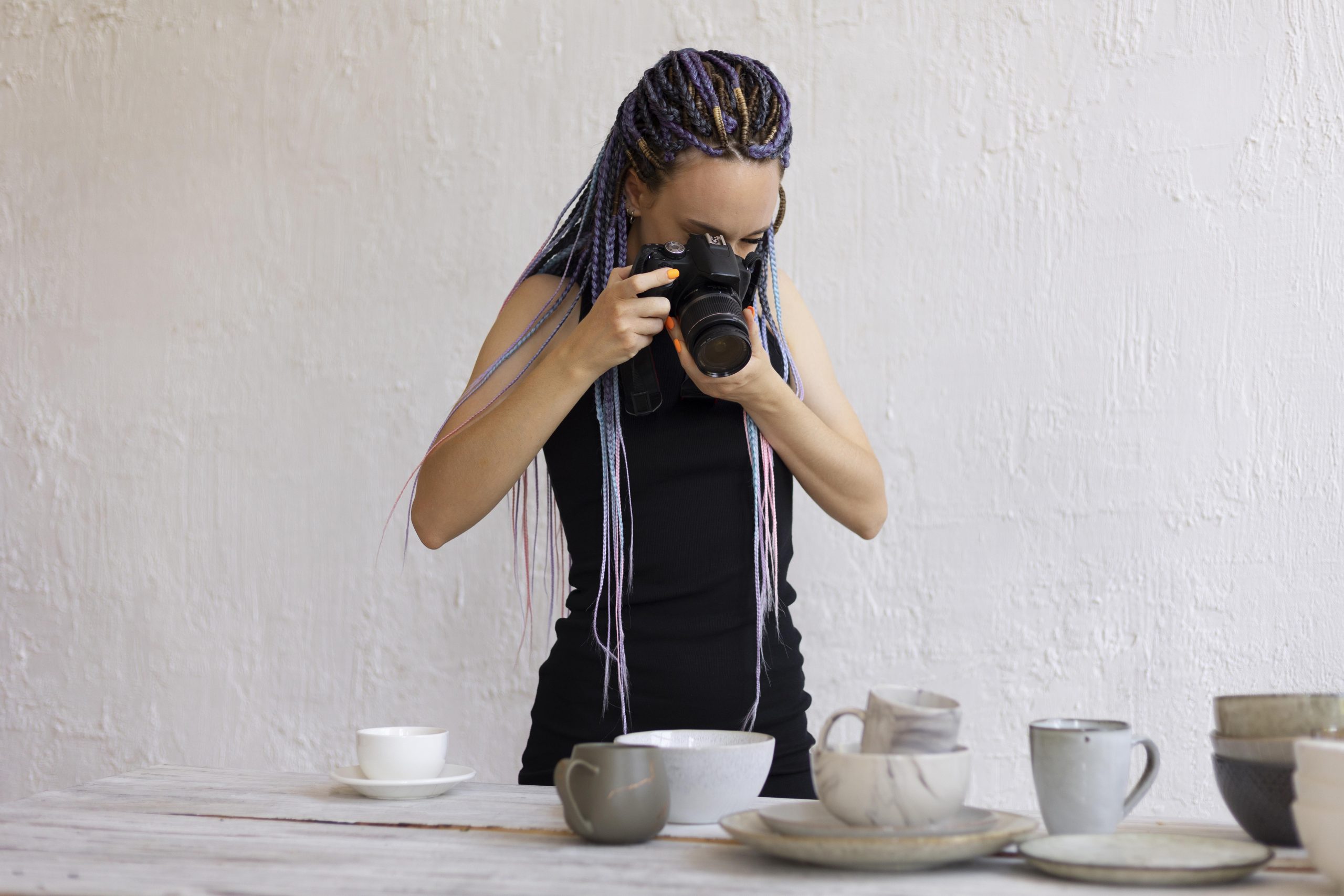
The good news? You don’t need a studio. You don’t need a £1,500 camera. And you definitely don’t need to learn Photoshop. Most of the best product photos on Crafter’s Market UK are taken by vendors on their phones, in their kitchens, using sunlight and a bit of common sense. ✨
This guide walks you through everything you actually need to know – the kit (or lack of), the setup, the shots, and the little tweaks that turn a “fine” photo into one that sells.
📸 Why product photos matter more than you think
Online, your photo is your product. It’s the first thing a customer sees, and most of the time it’s the only thing they’ll really look at before deciding whether to click.
A few things happen when photos are great:
- People trust the product more – they can see what they’re actually getting
- Your listing looks professional, even if you’re a one-person operation from your spare room
- You stand out in category browse pages (which is where most of our buyers find products)
- Customers share your photos on Pinterest and Instagram, which sends traffic back to your shop for free
And a few things happen when photos aren’t so great:
- People scroll past
- Those who do click feel unsure about buying
- Returns go up because the product looked different from the photo
- Your shop feels less trustworthy – even when it absolutely shouldn’t
Here’s the thing: great product photos are not about being a photographer. They’re about showing your work clearly, honestly, and in a way that makes someone think “yes, that one, please”.
✨ The only kit you actually need
Before we get into setups and shots, let’s reassure you on kit. Here’s everything you genuinely need to start:
- Your phone. Any phone made in the last five years will take photos good enough to sell with. Seriously.
- A window. Preferably one that gets indirect daylight (north-facing is the photographer’s dream, but any window works).
- A piece of white card, foam board, or even an A3 sheet of paper. This is your “reflector” and it’s the single cheapest upgrade you can make.
- A clean, plain surface. A wooden table, a neutral wall, a sheet of craft paper, a bit of linen – whatever fits your product’s vibe.
That’s it. If you want to spend something later, a small tripod (£10-15) and a second piece of white card are the only upgrades that’ll genuinely pay off. Don’t get suckered into buying ring lights and softboxes before you’ve squeezed everything out of a free window.
📌 Top tip: Clean your phone lens. Actually, clean it right now. It’s covered in fingerprints and it makes every photo slightly hazy without you realising. A microfibre cloth (or a clean t-shirt) will transform your photos in three seconds.
🪟 The window trick that changes everything
Ninety per cent of good product photography for makers is one thing: shooting near a window, with the light coming from the side.
Here’s the setup. Put your table or surface next to a window. The window should be to the left or right of your product, not behind you and not behind the product. Place your product in the pool of light. Now take a photo.
You’ll notice the “window side” of the product is bright and the opposite side is a bit dark. This is where your piece of white card comes in. Prop it up on the shadow side, angled to bounce light back onto the product. Suddenly your photo is evenly lit, your product looks three-dimensional, and colours look true to life. That’s the whole trick. ✨
A few rules of thumb:
- Avoid direct sunlight. Harsh sunbeams create hot spots and ugly shadows. If your window gets direct sun at the time you’re shooting, hang a thin white sheet or tracing paper over it to soften the light. Cheap and instantly better.
- Don’t use your ceiling light or lamps. Indoor bulbs cast a yellow or orange tint that’s a pain to correct. Turn them off and go all-in on daylight.
- Time of day matters. Morning and late afternoon light is softer and more flattering than midday. If you can only shoot at midday, find a north-facing window or diffuse the light.
- Cloudy days are your friend. Overcast skies are basically a giant natural softbox. Don’t wait for sunshine.
🎯 The shots every listing needs
Buyers don’t want one hero shot – they want to inspect your product the way they would in a shop. Here’s the shot list we recommend for every CMUK listing:
- The hero shot. Your best, cleanest, most beautiful photo of the product on its own. This is your main listing image and it does the heavy lifting in search results.
- Scale shot. Show the product being worn, held, or in a room setting so people can see how big it actually is. “I didn’t realise it was so small” is the #1 reason people return handmade items.
- Detail shot. Get close. Show the stitching, the brushstrokes, the grain of the wood, the sparkle of the stone. This is where handmade quality really sings.
- Angle shot. Side-on, top-down, or from behind – whatever reveals something the hero shot can’t.
- In-context shot. The product styled in its natural habitat. A mug on a breakfast table. A print on a wall. Earrings on an ear. This helps people picture owning it.
Five shots per listing sounds like a lot, but you can shoot them all in one 15-minute session per product once you’ve got the setup dialled in.
📌 Top tip: On CMUK, your Plus and Premium plans let you upload more gallery images per listing. Use them all. More good photos genuinely do sell more products.
🎨 Styling without going over the top
Good styling makes your product look desirable. Over-styling makes it look like a magazine advert and hides the actual item. There’s a balance.
A few principles:
- Your product is the star. Props should support, not compete. If someone’s eye goes to the dried orange slice next to your candle before the candle itself, the orange slice has to go.
- Pick a consistent look. Decide whether your shop is bright-and-minimal, warm-and-cosy, dark-and-moody, or playful-and-colourful – and stick to it across your listings. Consistency builds brand recognition.
- Less background, more product. Most buyers on mobile see your thumbnail at about the size of a postage stamp. Fill the frame.
- Props should match the buyer’s imagination. A handmade baby blanket looks great styled near a cot or folded on a nursery chair. A statement necklace looks great on a neutral neckline or a clean flat surface.
📱 Editing: less is more
Once you’ve shot your photos, a couple of small edits will take them from good to great. You don’t need to learn Lightroom – free mobile apps like Snapseed or Lightroom Mobile do the job brilliantly (we covered both in our free marketing tools post).
Stick to these four adjustments:
- Exposure / Brightness: Bump it up a notch if your photo looks dull. Most phone photos benefit from being slightly brighter than they come out.
- Contrast: A tiny nudge up adds depth. Don’t overdo it – you’ll lose the subtle texture that makes handmade products shine.
- White balance: If your photo looks yellow, cool it down. If it looks too blue, warm it up. The goal is for white things to actually look white.
- Crop: Cut out anything that isn’t the product or intentional styling. Tighter crops always sell better on category pages.
What to avoid: filters, heavy saturation, artificial bokeh, and anything that makes the product look different from what the buyer will actually receive. Handmade works because it’s honest – your photos should be too.
📌 Top tip: Edit all your product photos with the same settings. Consistency across your shop is what makes it feel properly branded rather than thrown together.
🚫 Five photo mistakes we see all the time
We look at a lot of listings. These are the most common photo issues that lose sales – and they’re all fixable in one afternoon.
- Shooting in the kitchen at 8pm under yellow bulbs. We’ve all done it. Don’t. Wait for daylight.
- Busy backgrounds. The patterned tablecloth has to go. So does the cluttered shelf in the background. Plain. Plain. Plain.
- One photo per listing. A single photo leaves buyers with too many unanswered questions. Five answers most of them before they’re even asked.
- Flash. Phone flash is brutal – it flattens everything and kills the lovely textures that make handmade handmade. Turn it off and reach for the window.
- Inconsistent sizing and style across a shop. If every product photo is shot on a different surface at a different distance, your shop looks scattered. Pick a setup and stick with it.
✨ A 30-minute challenge
Here’s a challenge for this weekend. Pick your three best-selling products. Re-shoot them using the window setup above. Upload the new photos. Come back in two weeks and check your views and sales. We’re willing to bet you’ll see a difference.
And when you’ve done it – we’d love to see. Tag us on Instagram @craftersmarketuk or share in our vendor community group. Showing off great photos is one of our favourite things. 📸
Marketing Magic for Makers is Crafter’s Market UK’s practical guide series for UK makers who want to grow their handmade business without the marketing overwhelm. Next up: how to write product descriptions that sell (without sounding like a robot). If you’re not already a CMUK vendor, you can start a shop for free here – no listing fees, no upfront costs, and we plant a tree with every order.